
Case study: Design Amazon Subscribe and Save app
The challenge: Design a user-friendly concept app where Amazon’s Subscribe and Save customers can easily shop for products and organize purchases to see effective cost savings.
The business: While Amazon is ubiquitous, not many users were aware of the Subscribe and Save feature or knew how to use it.
The team: I worked with a team of two other members to conduct user research and iterate on interface design approaches.
My role: I wrote interview questions and conducted interviews and affinity mapping, designed initial UI patterns and owned the assets of user flows, journey maps, and problem and solution statements.
Tools/timeframe
Two-week Agile sprint working with team to carry out research phase and design an efficient app with simple UI.
Sketch
InVision
Whimsical
Google Suite
Pen and paper
Design studio
iOS HIG design

Entry screen to final mockup for our app design.
Initial research: Our UX team found that while most users whom we interviewed had used Amazon and shopped online to purchase an assortment of products, the majority had never heard of Amazon’s “Subscribe and Save” feature. Before interviewing users, we mapped out “big picture” ideas to generate app possibilities. Interviews would determine whether these ideas were valid.
App feature ideas: As a team, we discussed various directions to go with our concept app, specifically considering ways of creating a budgeting tool within the app. The purpose of the Subscribe and Save feature is to save costs on frequently purchased items as well as to avoid the hassle of in-store shopping to pick up basic household goods each month.
Competitive analysis: To get a sense of other budgeting tools out there, our team checked out and compared budgeting apps such as Mint and Wells Fargo’s built-in budget breakdown for users.

Wells Fargo automatically separates money spent into categories and includes a pie chart allocating total monthly percentages.

Mint’s user interface breaks down dollars spent in each category per month.
Interviews: Next, as a team we interviewed both current and prospective Subscribe and Save users (7 total) to identify any problems and goals associated with their online shopping experiences, as well as to indicate whether a new budgeting tool would be useful.
What were the findings? Several themes emerged from our interview responses, including:
Users enjoy the ease and convenience of online shopping.
Users like to comparison shop for specific items to confirm whether they are getting a “good deal.”
Users who purchase recurring items online want the ability to “set it and forget it” until delivery arrives.
Any pain points? Despite the general ease of online shopping, some users encountered issues with Amazon’s system, such as:
Lack of transparency about price changes and inability to easily compare pricing.
It’s unclear on Amazon’s current interface what qualifies as a “Subscribe and Save” item or not.
Many day-to-day items are not needed in monthly quantities; end up buying too much stuff.
Affinity mapping
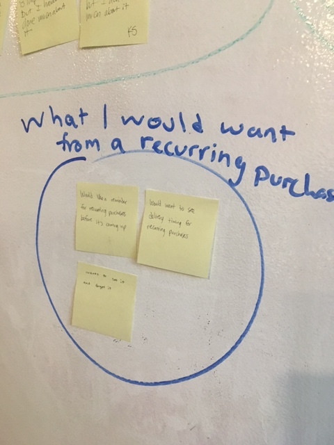


Takeaways: The main user goals and pain points became clearer after grouping responses thematically by affinity mapping.
Users want to save time and money by shopping online, and they want a way to track and budget for purchases.
Developing research assets: After compiling our team’s research findings, we started to develop assets to guide our design decisions. I took ownership of the problem and solution statements as well as the user flows and journey map for our user personas. My teammate Martha Asselin created the persona visual below, and we collectively created the persona traits.

A working family
Problem statement: Joe, a working professional and father, needs a better way to compare pricing and make sure deliveries are set up in a timely fashion. He is motivated mainly by saving time to have more to spend with family, but would also like to see opportunities to comparison shop.
Solution statement: The Amazon Subscribe and Save app will allow users to track their monthly spending on recurring purchases, break down how much money they are spending in each category, compare spending from month to month, and enable users to compare different brand pricing. The app gives users confidence and satisfaction that they are aware of their monthly spending habits and have control over changes when necessary, offering notifications to help users stay on track.
A user journey map: I created a journey map in Sketch illustrating the emotional arc of a user finding products and completing a purchase on Amazon’s current website, highlighting pain points and areas for improvement. The color palette used is made up of Amazon’s official style guide of colors.

What next? How do you take all of this research and incorporate it into a better design? Keeping our user needs and goals in mind, to kick off the second week our team held a design studio to quickly sketch out various ideas we had for interface design onto paper.
Wireframe iterations: All three of our team members started to create wireframes in Sketch to design our ideas, before coming together and deciding on one wireframe to move forward, integrating other design features into that.
Featured below: My Sketch wireframes and prototypes are displayed here, showing my design ideas and what I contributed that made it into our final designs.

Initial wireframes
A couple of wireframes here show how a user could easily set a budget or manage an Amazon subscription to save time and money. The budgeting bar shows how much current purchases measure into their total budgeting goals.
Key feature: Although we used my teammate Isaac Kazin’s Sketch wireframes to complete our final mockup phases, a couple of my design iterations were used as key UX design features. I created a “Swap” button after a product is selected so that a user can easily compare similar products to one another and decide whether to swap out products saving on cost or other factors.

Make easy swaps
The ability to compare brands at a glance and see major differences, such as price, was a key feature that became a part of our team’s more developed, high-fidelity prototypes. It reinforced the ease of use and transparency that our users wanted.
Interface design mockups: Moving our Agile design phase forward, we worked as a team to collaborate on feature elements, visuals and microcopy to accomplish our users’ goals. Below is a higher-fidelity mockup showing how we incorporated the “swap” feature using iOS HIG design standards.

Budgeting tools: Our users expressed a strong desire to save time and money while online shopping. As such, setting monthly or annual budgets to track how much money was being spent on Amazon purchases was a major design goal. We ideated on possible ways to monitor and track budgets, landing on a couple of different screens to see how and where a user is spending money.

The screen on the left shows how much of the user’s total budget is being spent per category, while the right screen shows how spending varies per month.
Cleaning it up: Another user complaint we discovered upon testing Amazon’s current site is that pages are cluttered with too much information, too many distractions. Our team sought to de-clutter our Product Description Pages and Subscription app screens with only the most important product information.
How much to buy for savings? One of the ways subscribers can save money through Amazon’s Subscribe and Save program is to sign up for five monthly items to get a 15% savings. However, that stipulation was not clear to some users. We added a tracking bar to visualize more clearly how users can get the 15% total discount.

Users can manage their monthly subscriptions with just a couple swipes.
final reflections
Results: Based on our research findings, our team set out to design an app that would accomplish the goal of saving users time and money while shopping via Amazon’s Subscribe and Save. Users could be confident they were staying on budget and were in control of monthly spending by using our app. Many users said they loved the convenience of online shopping but find the lack of transparency and inability to track expenses to be frustrating. Every design decision we made kept those user goals and pain points in mind to create a simpler and more satisfying online shopping experience.
Future changes, iterations: As with any Agile design strategy, our further usability testing and feedback illuminated more changes we could make to the app going forward, such as changing the direction of tracking bar arrows (shown in the screen above) to indicate progress towards five selected products earning a discount. We would also be more conscious about integrating Amazon’s color scheme into our style guide to maintain brand consistency. We would add more detail and variability to the budget tracking screens.
Overall goal met: All in all, though, we created a concept app that successfully addressed many of the current issues with Amazon Subscribe and Save and would keep happy customers coming back.